AI product experiment that resulted in 421 leads in the first month
Solo build: design, product, code and growth using Claude Code + Figma MCP
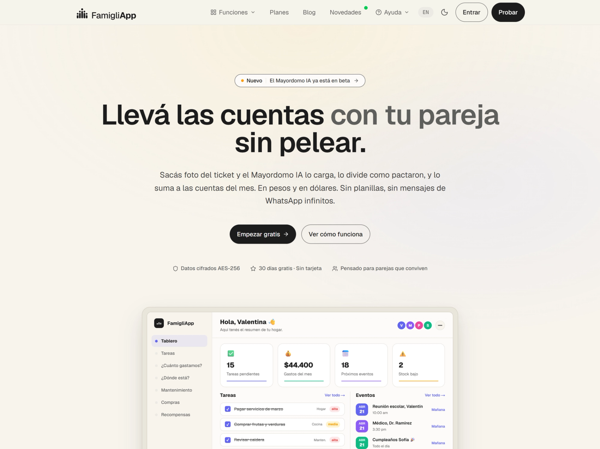
I wanted to see how far I could get building a real product with AI doing most of the coding. FamigliApp is a household app that is actually live: it has real users, it charges money, and the login has to work at 3am when someone is adding milk to the shopping list.
- Solo build
- Product strategy
- Design systems
- AI-assisted
- Role
- Solo build: design, product, code and growth using Claude Code + Figma MCP
- Duration
- 46 days
- Location
- Argentina
Outcomes & evidence
What 30 days of paid traffic actually did.
A $150 Google Ads test, Apr 30 to May 29, pointed at the Spanish open beta.
Numbers I can back up with a screenshot or a SQL query.
- Google Ads impressions
- 123,728Google Ads impressions
- Visitors in the first 30 days
- 4,475Visitors in the first 30 days
- Conversion rate from lead to trial
- 34.9%Conversion rate from lead to trial
- Leads captured
- 421Leads captured
I noticed that many households are disorganized. No one really knows where the money goes, or how tasks, events and expenses are being coordinated. That creates a mental load that gets distributed across family members.
The starting observation
Not mockups, the shipped app
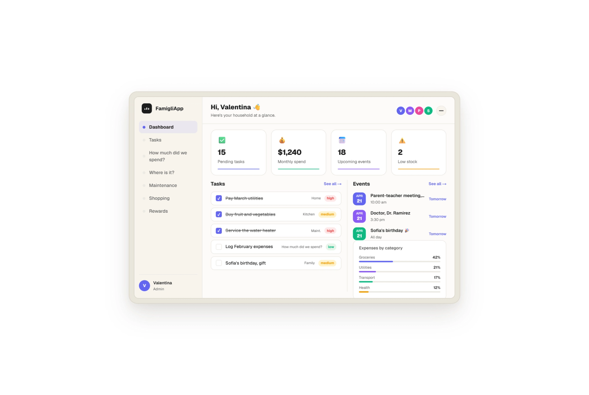
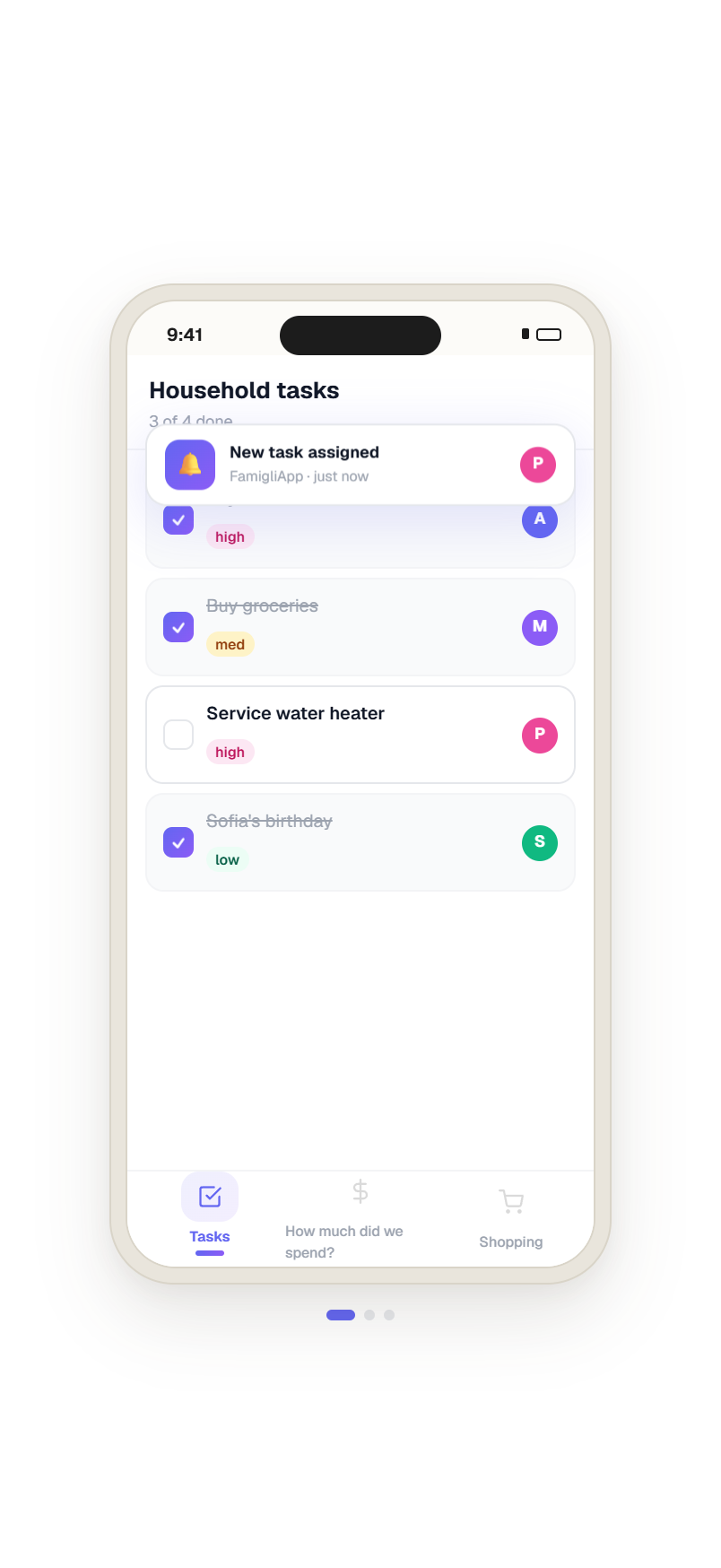
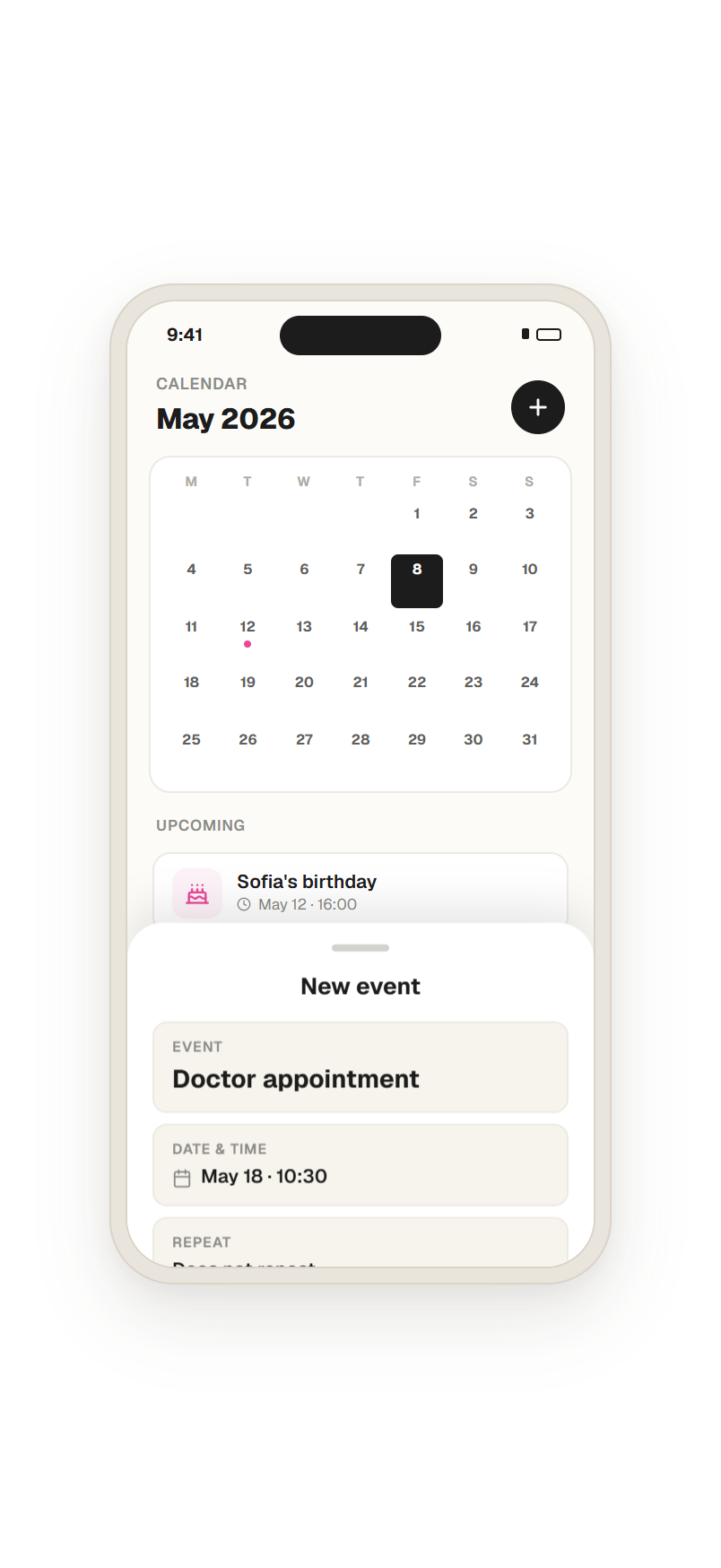
Every screen below is the actual FamigliApp UI, pulled straight from the live production routes. Click any image to see it full size.
The butler is one tap away
Tap the bubble. Ask anything about your home: expenses, the shared calendar, what is running low. The butler pulls from the same data as your dashboard and answers in plain language.
Tap to open
A single bubble, always in reach.
Ask anything
Plain language, no menu to learn.
Instant answer
Reads the same data as the dashboard.
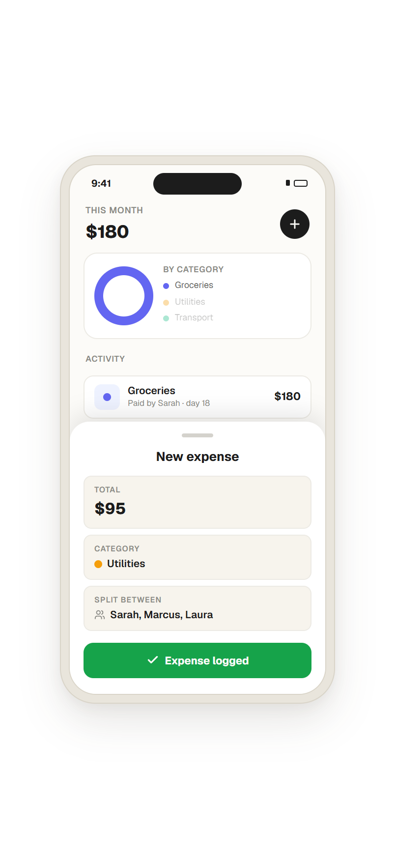
An expense in five seconds
Amount, category, who paid, how it splits. The new-expense sheet is built to use with one hand while you are standing at the checkout.
If logging an expense takes more effort than the expense is worth, people stop after the first try. Most of the work here went into keeping that habit alive past the first week. Making it look nice was secondary.
This is how I speed up my work with AI
Design and code: instead of using Figma, I started using VS Code with Claude Code. From day one I was building via the terminal.
Solo product builder: that way I could test the app working and iterate doing my own usability testing, share it with my family, and have other people try what I built right away.
Solving real problems: I designed an expense sheet one morning, had it live by the afternoon, and watched people use it that night.
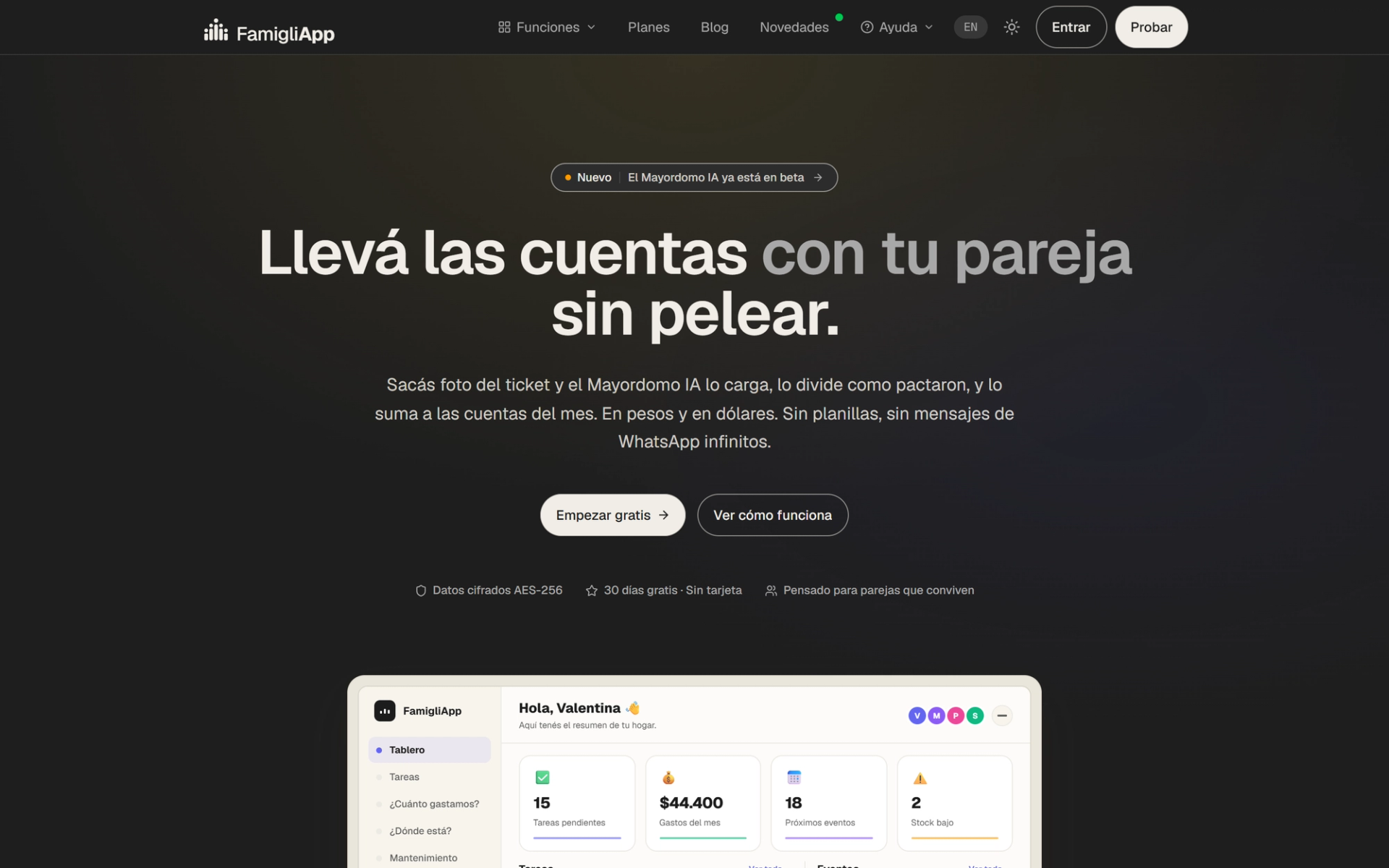
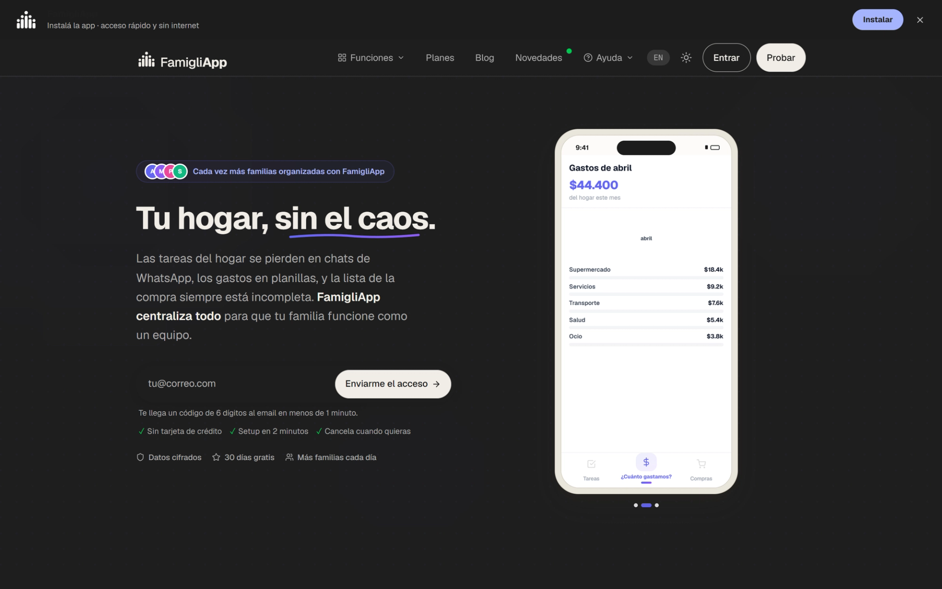
From V1 to V2
Why couples first
An earlier version did everything right on paper and connected with nobody. It tried to talk to five kinds of users at once, and by aiming at everyone it landed with no one. That felt like a positioning problem, not a code problem.
Six reasons I started here
Track money with your partner without fighting about it. Shared expenses, splits, and settling up in one tap.
- It is the friction that comes up most, and most emotionally. Couples argue about shared money constantly.
- The pitch is something a real person actually says out loud.
- You get two active users per household instead of one.
- The loop is easy to demo: capture, split, settle.
- Couples tell each other about stuff that works.
- Families and roommates are basically the couples loop with more people.
Families with kids
One place for the whole family: chores, rewards, calendar, and shopping, all in sync.
Large families
Keep a big family coordinated without the daily chaos. Assign tasks to several people, set recurring routines, and run it all from one shared command center.
The commit journey
The shape of a solo sprint.
Each bar is one working day, taken from the repository history. The pace eased off on purpose toward the end, as I shifted from building the product to polishing it and setting up the commercial side: landings, SEO, billing, reactivation emails. I built this at night, on weekends and in between things, while working full time as a UX/Web lead at a Series D health-tech company. Whatever I shipped had to keep running while I was asleep for 8 hours, so it is all serverless.
- Days
- 46Days
- Commits
- 1,150Commits
- Core features
- 9Core features
View as table
| Date | Commits per day |
|---|---|
| Apr 6 | 7 |
| Apr 7 | 72 |
| Apr 8 | 18 |
| Apr 8 | 64 |
| Apr 9 | 18 |
| Apr 10 | 30 |
| Apr 11 | 21 |
| Apr 12 | 35 |
| Apr 13 | 41 |
| Apr 14 | 50 |
| Apr 15 | 35 |
| Apr 16 | 59 |
| Apr 16 | 24 |
| Apr 17 | 54 |
| Apr 18 | 41 |
| Apr 19 | 37 |
| Apr 19 | 37 |
| Apr 20 | 25 |
| Apr 21 | 42 |
| Apr 22 | 29 |
| Apr 23 | 33 |
| Apr 24 | 22 |
| Apr 25 | 16 |
| Apr 25 | 9 |
| Apr 26 | 2 |
| Apr 27 | 26 |
| Apr 28 | 31 |
| Apr 29 | 39 |
| Apr 30 | 35 |
| May 2 | 16 |
| May 3 | 22 |
| May 4 | 12 |
| May 5 | 2 |
| May 7 | 2 |
| May 8 | 17 |
| May 9 | 1 |
| May 11 | 8 |
| May 12 | 19 |
| May 14 | 27 |
| May 16 | 13 |
| May 17 | 3 |
| May 19 | 36 |
| May 21 | 1 |
| May 22 | 8 |
| May 24 | 9 |
| May 25 | 3 |
The three calls that shaped the product
The decisions that actually changed how the product gets found, paid for, and trusted.
Decision #1 · Strategy — same code, two audiences
Run a Spanish open beta and an English portfolio demo off one codebase.
Why this path: test the app with real users from Argentina, while sharing an English version for hiring managers.
What I learned: these two audiences want opposite things, and one shared funnel would have done a bad job for both. The downside was more surface to maintain.
- Considered: one funnel for everyone
- Considered: translate everything but keep one gate
- Chosen: two locales, two purposes
Decision #2 · Design system — narrow to couples first
Replace the generalist V2 homepage with a couples-focused V3, plus four persona landings on one bento template.
Why this path: with the bento template, every persona page has to use the same pieces, so I stopped piling up design debt every time I added one.
What I learned: forcing every persona onto the same components is the only reason the design stayed manageable as it grew.
- Considered: keep V2 and A/B test copy
- Considered: one landing per ad campaign
- Chosen: bento system with reusable cards per persona
Decision #3 · Sign-up workflow — send my own codes
Signups were breaking for people on Outlook and Hotmail. The confirmation emails just were not showing up, and that is a big chunk of users in Argentina.
I spent May 17 to 19 redoing the email setup: moved transactional sending to Resend Pro from hola@famigli.app with the DNS records set up properly, and switched from a magic link to a 6-digit code. The anti-phishing scanners on those providers were clicking the magic link first and burning it before the person ever got to it.
What I learned: I had filed this as a minor bug, and it was actually stopping people from signing up at all. I almost left it for later.
Code was the easy 5%
Shipping a product is mostly not coding. Writing FamigliApp was maybe 5% of the work. The other 95% is getting it in front of the right people and getting them to actually want it. AI makes that 5% much faster. It does not really help with the 95%.
- Distribution — getting discovered. SEO, launching in multiple locales, a separate landing per persona. If nobody sees the product it has zero users, however clean the code is.
- Desirability — making people want it. Positioning, copy and real lifestyle photos. This is all design work, and it is what decides whether people stick around.
- Legal and accounting — what you do not vibe-code. Terms, privacy and data handling, billing, taxes, invoicing.
The hard part has moved. It is not writing the app anymore, it is the strategy, the taste, and having the right people around you for the parts you cannot do yourself.
Month one · Google Ads
- Clicks at $0.03 each, 4.8% CTR
- 5,930Clicks at $0.03 each, 4.8% CTR
- Demos started
- 146Demos started
- Activated, 45% of demos
- 65Activated, 45% of demos
A $150 test over 30 days, Apr 30 to May 29, pointed at the Spanish open beta. Small budget, but enough to learn something.
The cheap part worked fine. The hard part is further down: most people who started a demo only opened 0 to 3 of the 12 modules, and almost nobody went from demo to paying yet.
So month one told me the problem is not getting traffic. It is getting people to actually use it and want it, which is the 95% again.
A design system built from scratch
This is the part I am most curious about long term. Instead of a separate landing per campaign, which racks up design debt fast, I built one bento system that handles all five personas with the same components.
Tokens are three layers. Primitives are raw, context-free values that no component reads directly. Semantic tokens carry meaning and are theme-aware, and they are the only layer the UI touches. Component tokens are contextual, composed from semantic values plus the spacing scale.
Every grey is the same ink hue at different opacities, coherent by construction rather than arbitrary hex. Never pure white. Typography is Geist at three weights only, 400, 500 and 600, with hierarchy coming from size and letter-spacing rather than weight. Negative letter-spacing scales with size: headlines compress, body stays open.
Contrast, checked
Target is WCAG 2.1 AA in both light and dark. The primary button went from 3.5:1 to 4.8:1 when the palette moved from purple to green.
- AaThe quick brown fox
Charcoal on cream
#1c1c1c / #f7f4ed
15.51:1AAA - AaThe quick brown fox
Off-white on charcoal
#fcfbf8 / #1c1c1c
16.47:1AAA - AaThe quick brown fox
Muted on cream
#5f5f5d / #f7f4ed
5.83:1AA - AaThe quick brown fox
Accent on charcoal
#f59e0a / #1c1c1c
7.93:1AAA
Computed with the WCAG 2.1 relative-luminance formula at build time. Target is AA — 4.5:1 for body text, 3:1 for large.
Three times the code looked done and wasn’t
AI wrote most of the code. A few times it gave me something that looked finished and was not, and those were the most interesting moments. None of these got caught by the model itself.
The app said it worked when it hadn’t
The app told people they were signed up for reminders. They were not. Nothing threw an error, the screen looked completely done, but underneath the request had failed and the app reported success anyway.
Now I do not trust a success message until I have seen the data behind it.
Reminders quietly stopped going out
One small missing detail meant the app stopped sending event reminders, without saying anything. No error, no warning, nothing in the logs, just reminders that never arrived.
Nothing marked itself as broken, so I had to go looking.
Code that looked right but didn’t fit
The AI wrote code that looked perfectly correct, but the database rejected it and the app would not start at all. It read fine, it just did not match how the real system actually worked.
I still have to check that it matches the real system, every time.
None of these showed up as a failed test or a broken screen. The AI is good at producing work that looks convincing, so my job is to assume it might be wrong even when everything looks finished, and check anyway.
Trust and platform
Shared household money meant I could not get data isolation wrong. Every household is walled off at the database level with row-level security, on every table, so one household can never see another’s expenses, tasks or balances. It is the default, not a setting someone has to remember to switch on.
It is a mobile-first PWA with web push rather than a native app. One codebase, every deploy live instantly, no app-store reviews and no two native apps to keep in sync.
What I’d do next
This is still early, so I would rather end on the open questions than a victory lap. I still think narrowing the audience down to couples was the right call, but I have not actually proven it converts better yet.
What I want to do next is measure the couples loop properly: where people drop off in the task and expense flows, and how it compares head to head against the old version. That is the only way I will know if the new flow is genuinely easier or if it just feels that way to me because I am the one who made it.
The thing I am sure about is the speed. With Claude Code and Figma MCP, going from a design idea to something real users can touch takes hours now. I designed an expense sheet one morning, had it live by the afternoon, and watched people use it that night. That still catches me off guard, and I am still learning how to use it well.
Related projects
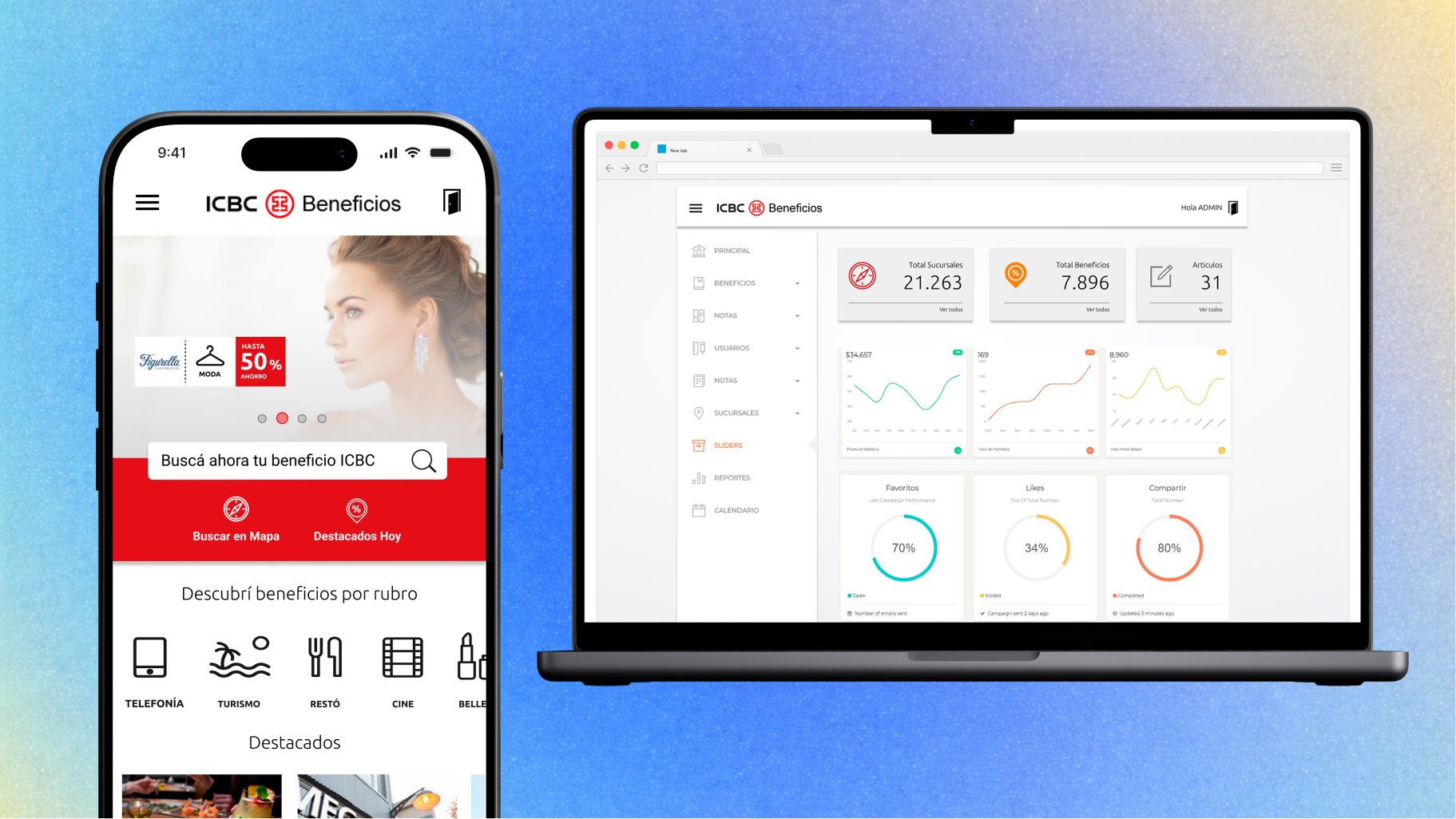


Mobile-First Progressive Web App & Multistore Marketplace
ICBC Mall Argentina is a custom marketplace focused on home, tech and travel, plus loyalty reward strategies to improve ROI and credit card usage. Figma prototype ready in 2 weeks to pitch the idea to our client.
- Growth Rate
- 150%Growth Rate
- Target Audience
- 2M+Target Audience
- Unique Visitors
- 200K+Unique Visitors
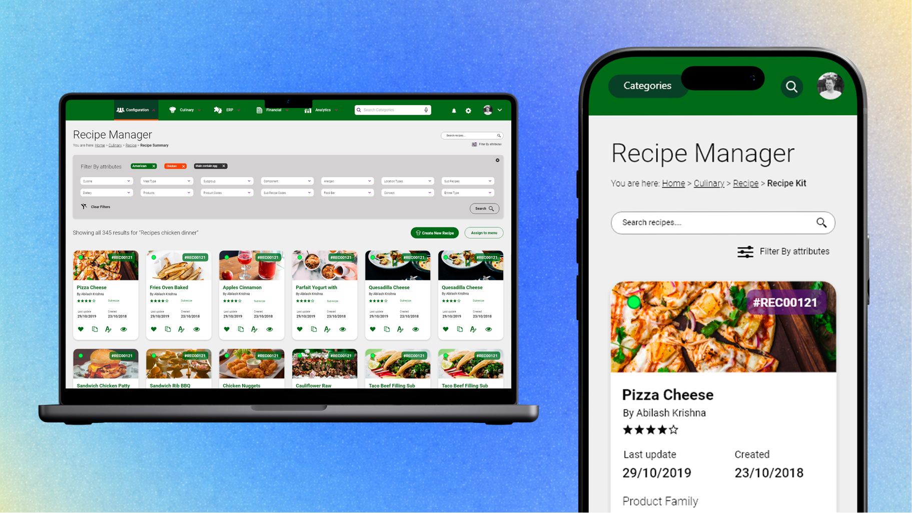


Revamp Foodservice SaaS Digital Experience
Highly complex ERP software focused on delivering meals for universities, hospitals and big catering companies. 12+ weeks leading the UX/UI design process to revamp the solution after 15 years on the market.
- Employees
- 1000+Employees
- SaaS Cloud Platform
- B2BSaaS Cloud Platform
- Unique Users
- 60,000Unique Users