Revamp Foodservice SaaS Digital Experience
Culinary Digital · Senior Product Designer, UX strategy lead
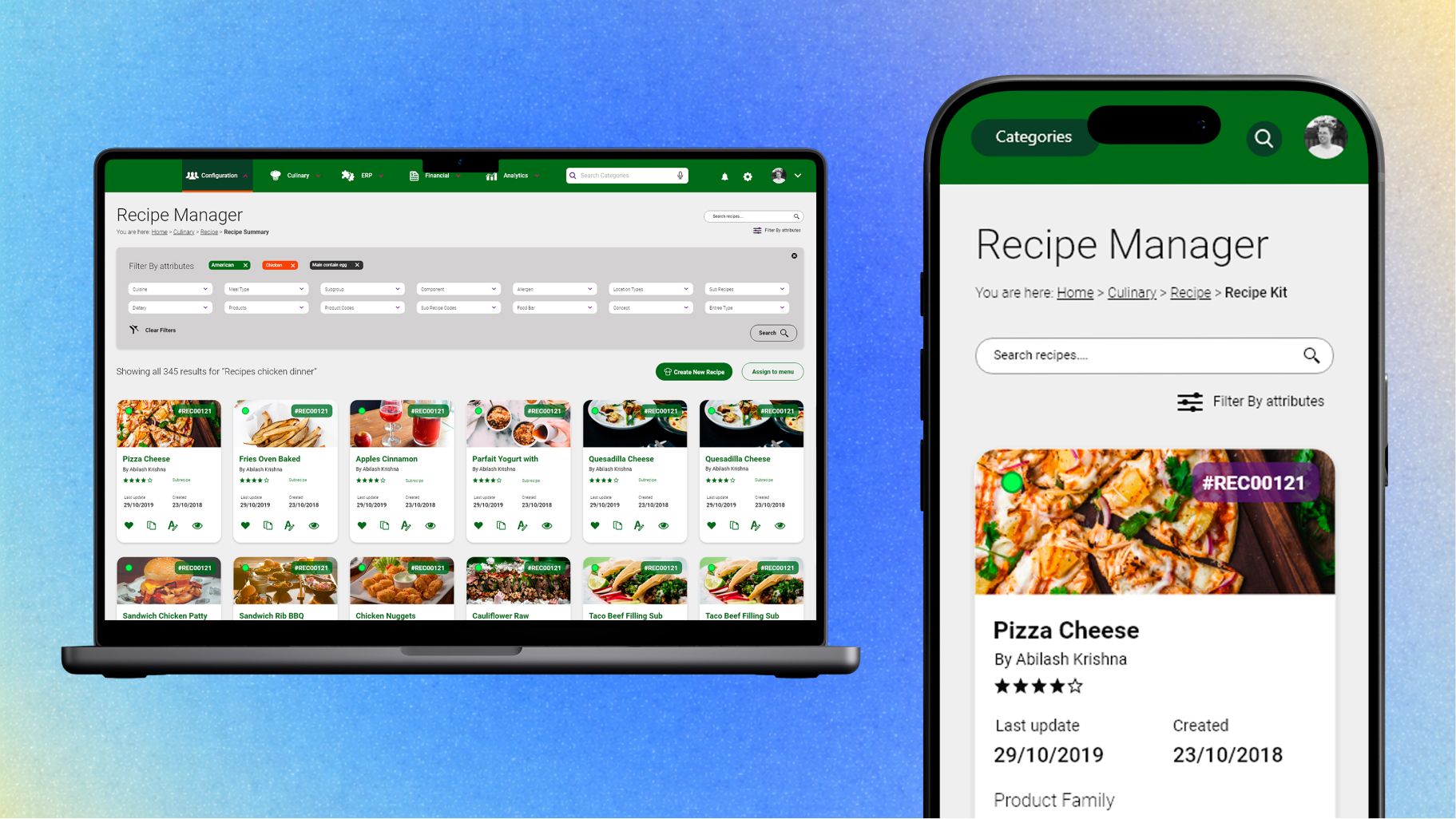
I co-led a UX/UI design project for a SaaS ERP platform serving 60K+ professionals, operating successfully for 15 years in the United States foodservice market. During 12 intensive weeks the solution was reimagined to streamline inventory, procurement and menu planning, unlocking faster workflows across hospitals, universities and school cafeterias.
- Enterprise UX
- Design Systems
- ERP
- Mobile-first
- Client
- Culinary Digital
- Role
- Senior Product Designer, UX strategy lead
- Duration
- 12 weeks
- Location
- NJ / NY, USA

From Saturday to Saturday
The outdated Foodservice SaaS was slowing down critical operations inside industrial kitchen teams, like recipe management and ordering.
Our full team was composed of the VP of Product, Creative Global Director, Engineering Lead, the development team, and our UX/UI design team of two. With only 12 weeks ahead, we aimed to redesign the platform with a modern, mobile-first UX that reduced friction and let users focus on food quality.
Real operations: food business systems
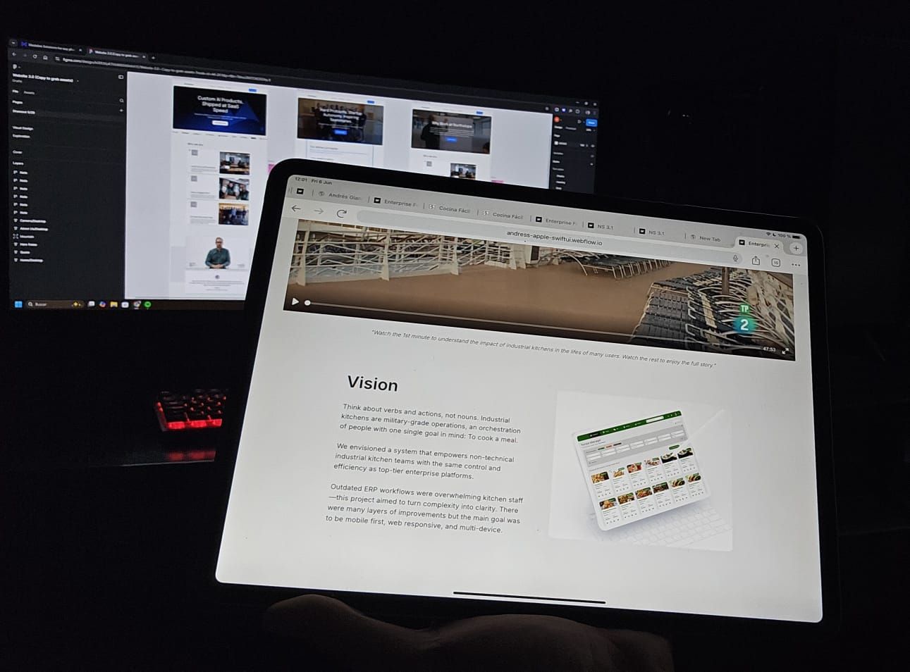
To speed up my design thinking process, I used a video on Royal Caribbean’s massive culinary operation as an alternative research method to understand large-scale food service systems.
This gave me valuable insight into real workflows, team hierarchies, and the daily challenges faced by over 500 kitchen staff. Observing how each role connects with logistics, operations and sanitation helped bridge the gap between our system’s functionality and actual user needs.

Think about verbs and actions, not nouns.
The vision, in one line
Vision
Industrial kitchens are military-grade operations, an orchestration of people with one single goal in mind: to cook a meal.
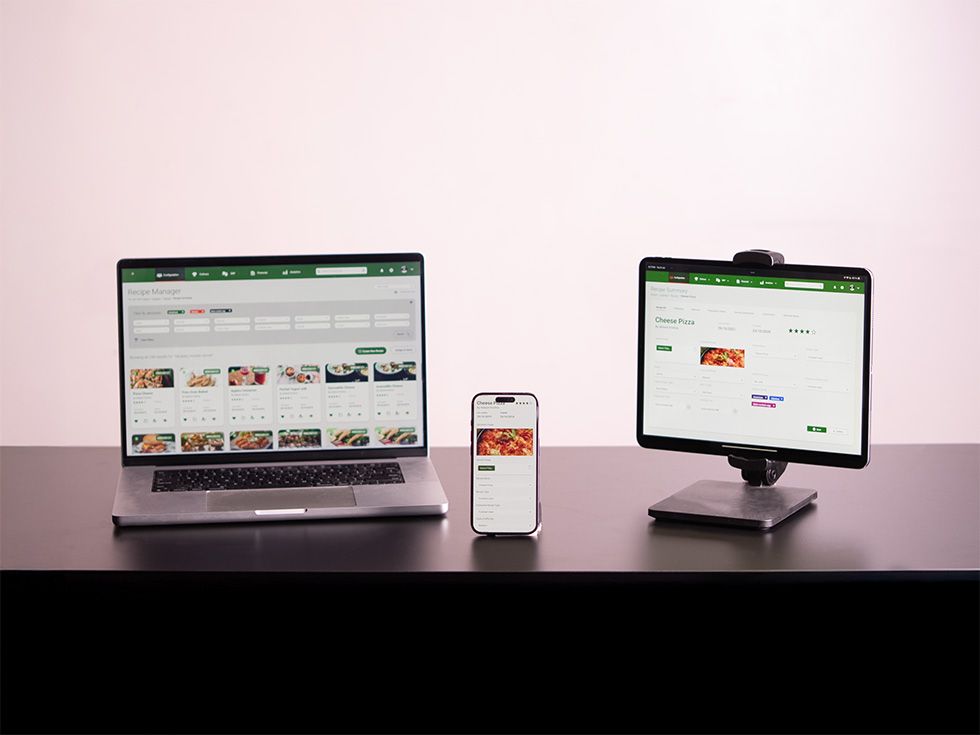
We envisioned a system that empowers non-technical industrial kitchen teams with the same control and efficiency as top-tier enterprise platforms. This project aimed to turn complexity into clarity. There were many layers of improvement, but the main goal was to be mobile-first, web responsive and multi-device friendly across desktop, tablet and mobile.
Discovery
As a Senior Product Designer, I led the UX strategy for a large-scale Foodservice ERP, addressing the needs of 10+ distinct user types across finance, operations and compliance.
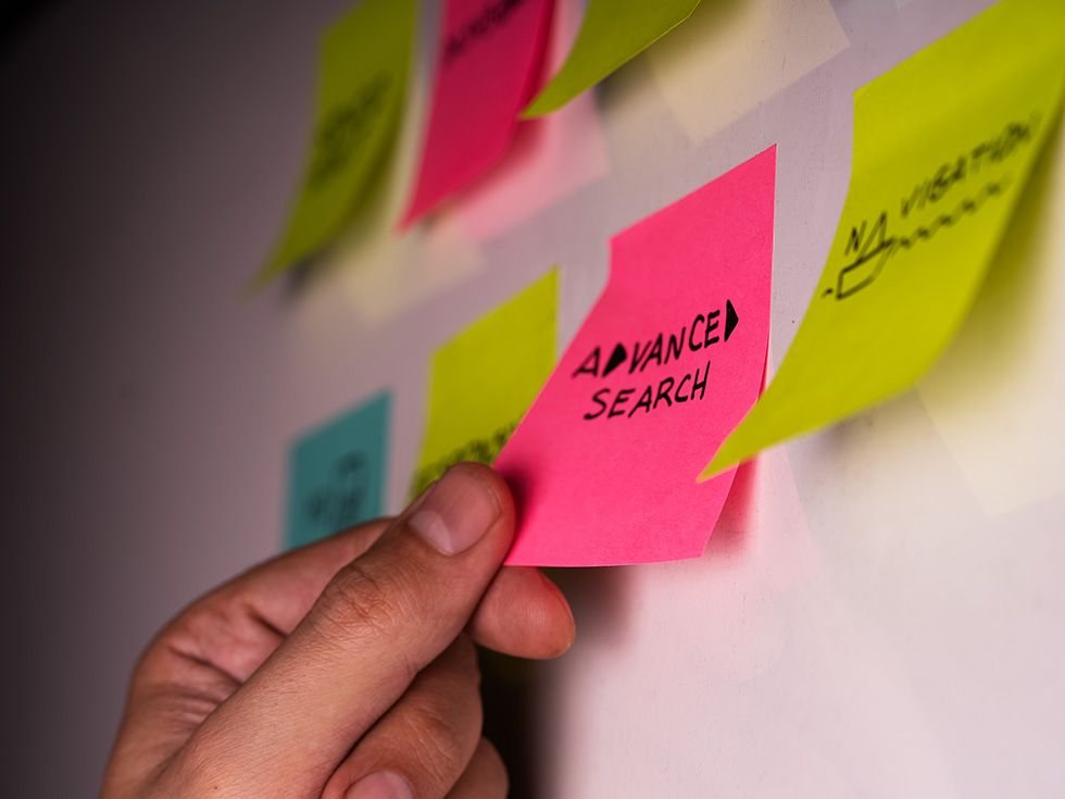
Through card sorting, rapid testing and benchmarking, we uncovered navigation as a core pain point. In collaboration with engineers, legal and executive stakeholders, I restructured the system’s architecture around role-based workflows to streamline access to critical dashboards and lists.
Weekly reviews with engineers and PMs ensured dev-ready designs, while iterative feedback from legal, nutrition and kitchen staff shaped a pilot-tested, cross-functional solution.
User personas
1 / 6
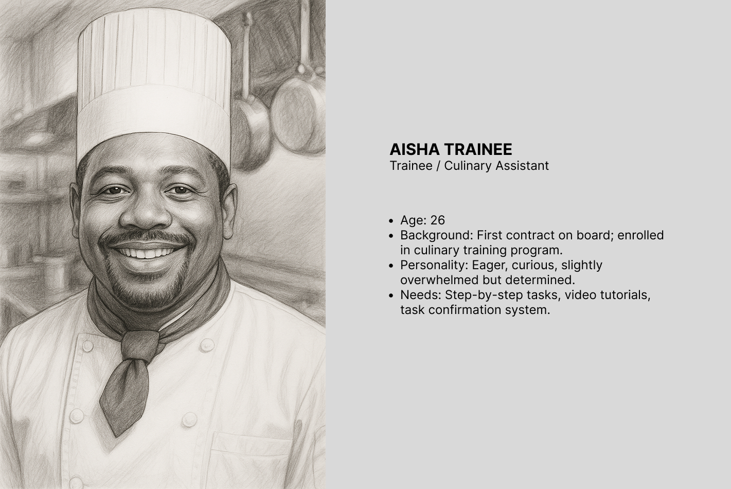
Aisha Khan 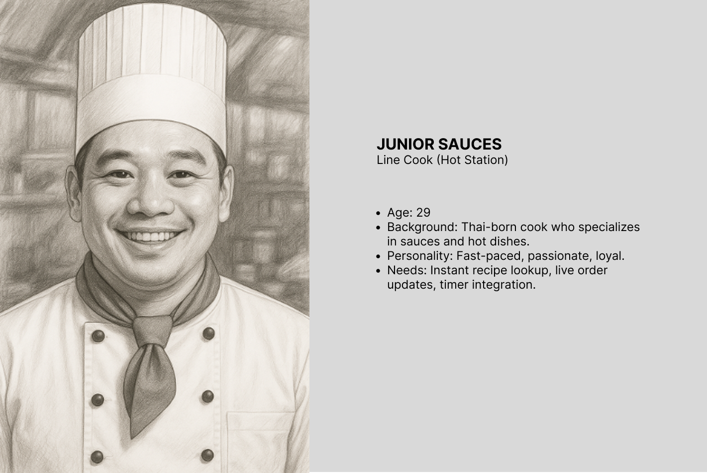
Junior Thai 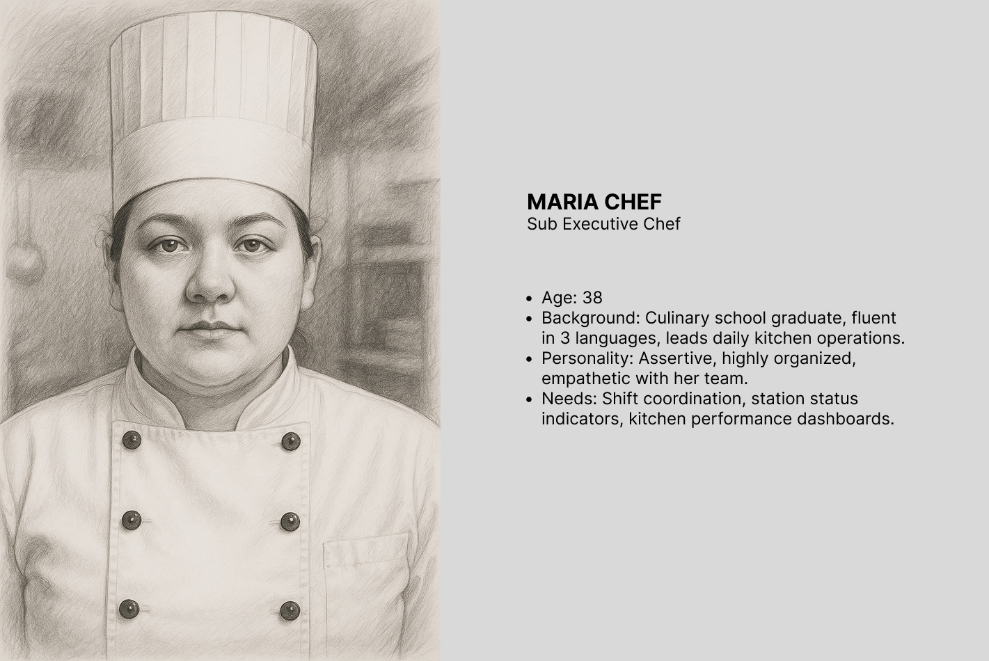
Maria Santos 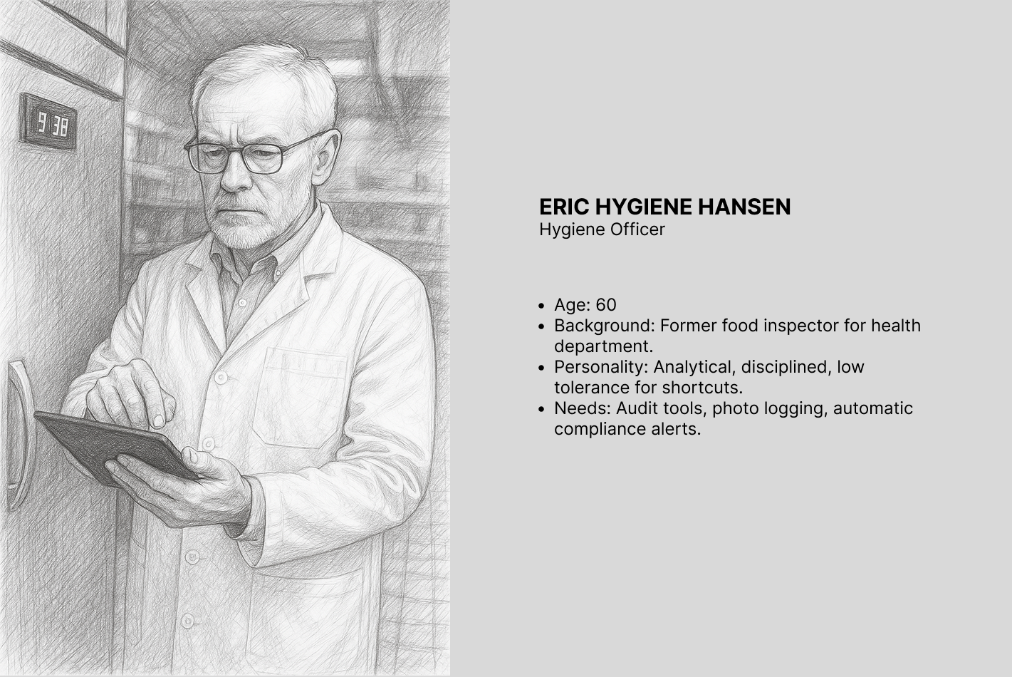
Eric Hansen 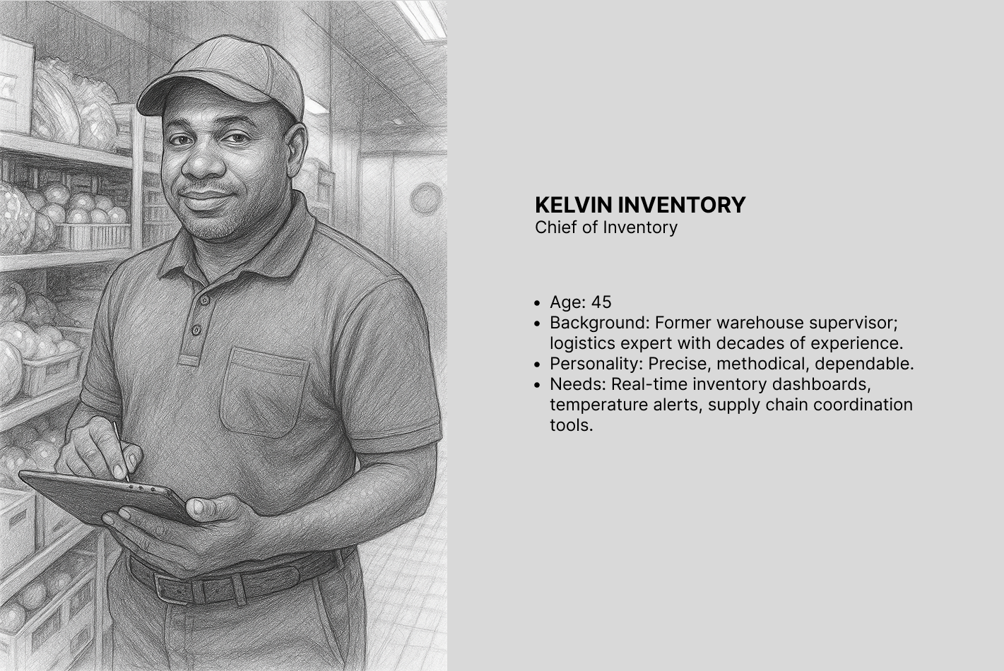
Kelvin Brown 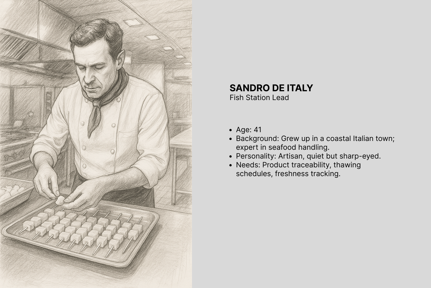
Sandro De Luca
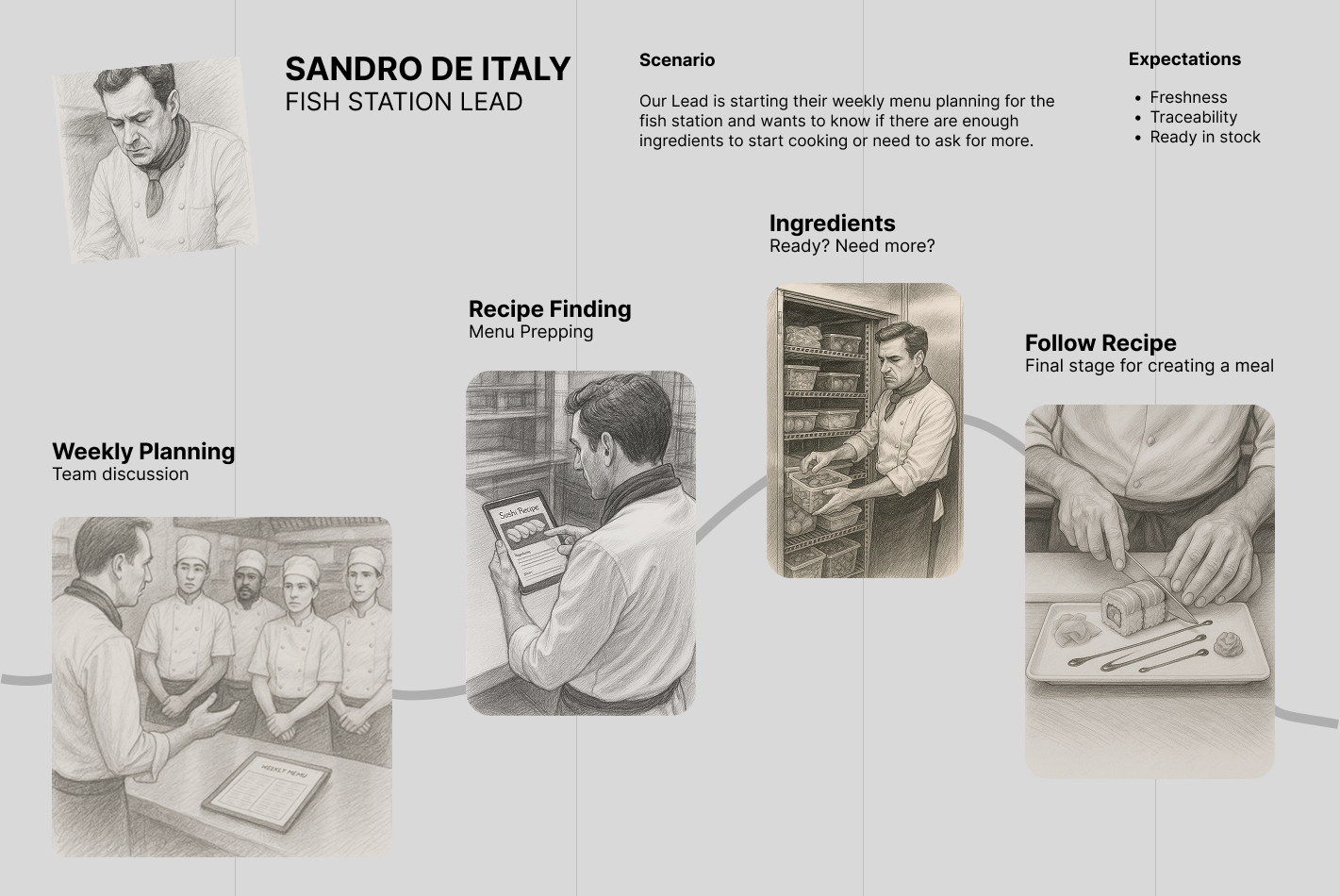
User journey map
Based on our discovery phase, we came up with ideas to help our users be more productive and stay away from the screens, in front of the kitchen.
Wireframes
We explored several routes for a heavy, content-based software. The menu was organised into five main categories — Culinary, ERP, Financial, Analytics, Users — across at least 70 unique software areas to review as an admin user.
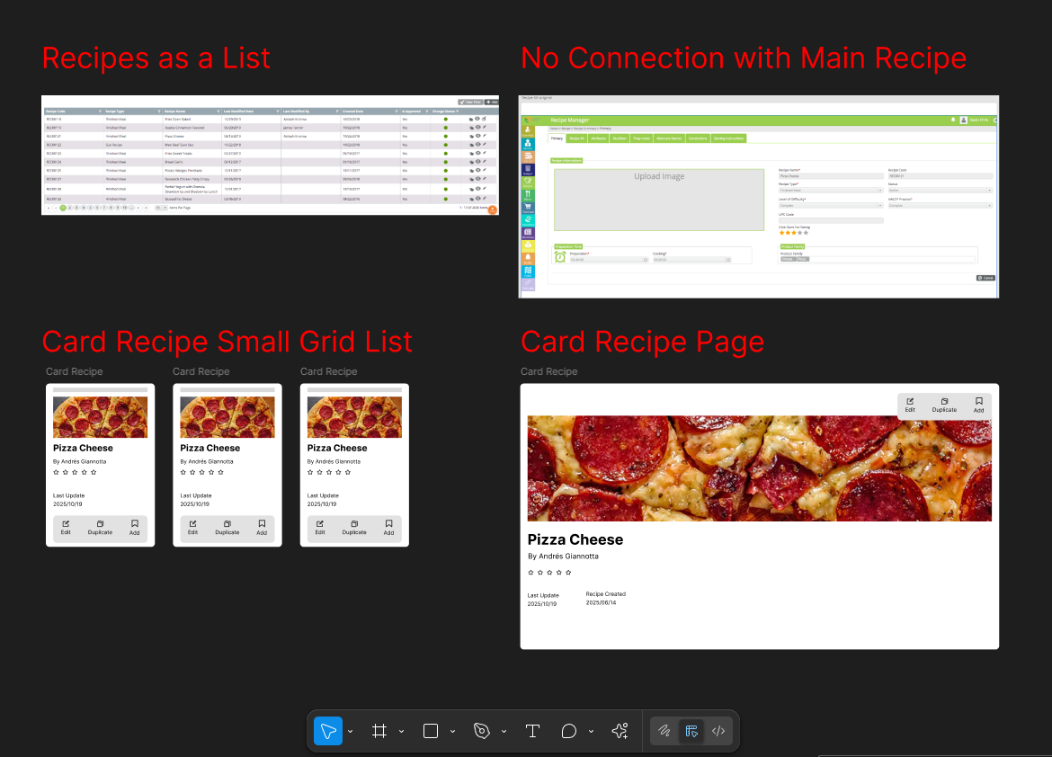
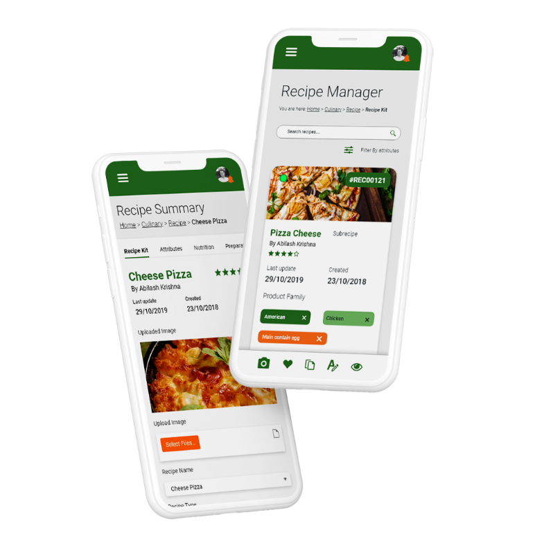
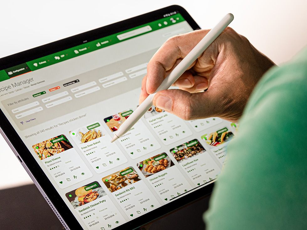
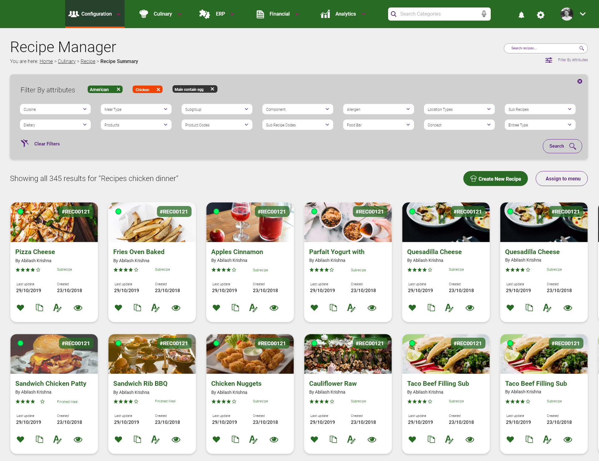
Recipe Manager: advanced search, with a card grid tested against a small list view for information density — how much a chef can scan at a glance versus how much fits on screen.
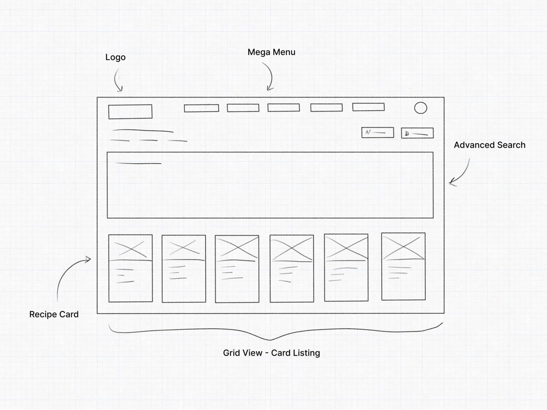
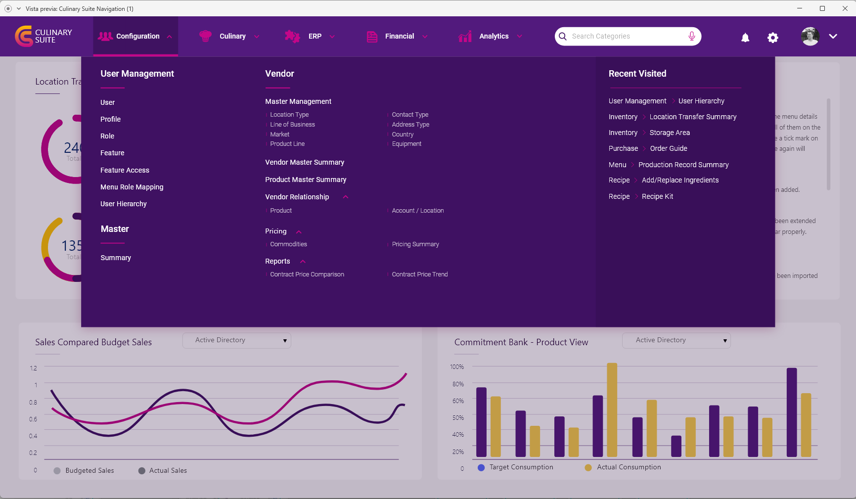
Cards and main navigation
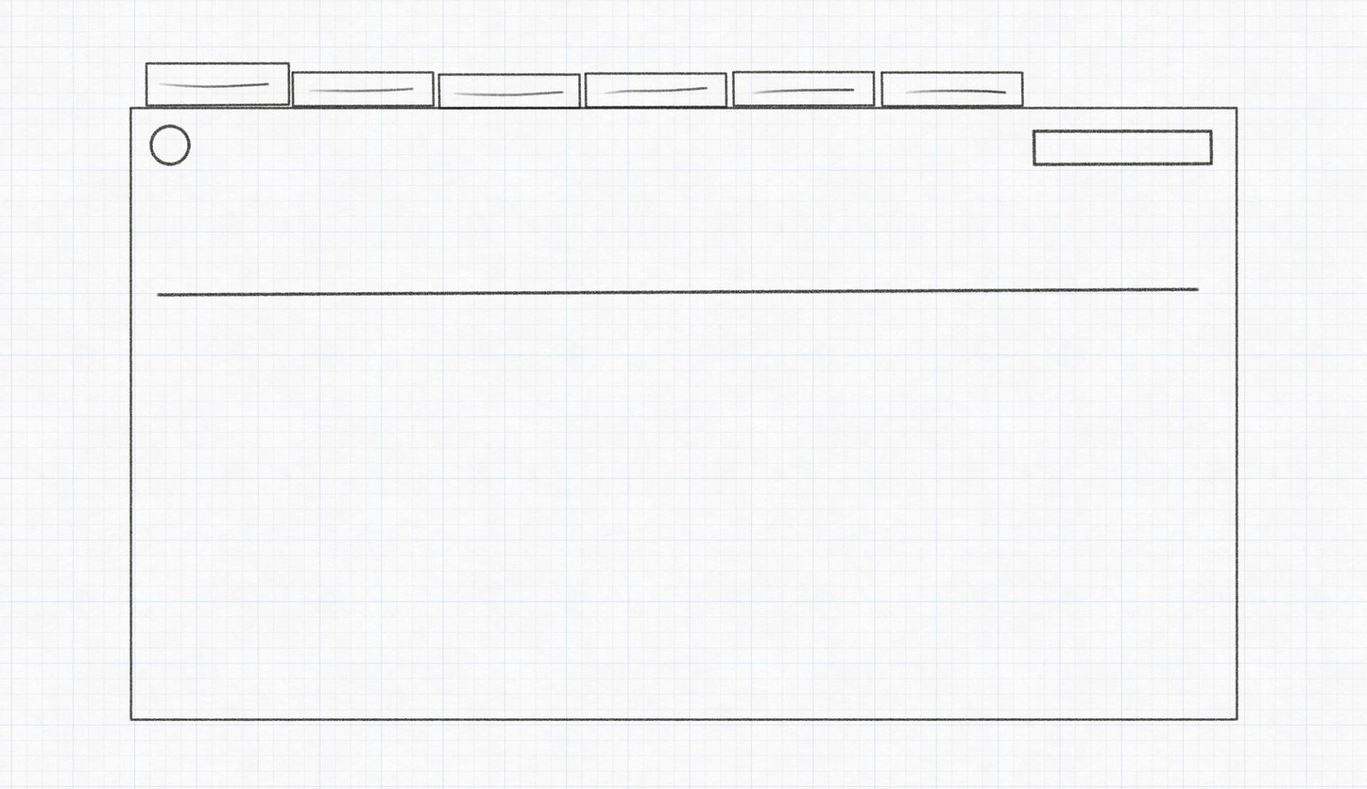
Mega menu, off-canvas, overlay and dropdown, compared against 70 destinations and five top-level categories.
1 / 4
Menu recipe full view, XL card Card grid against small list view 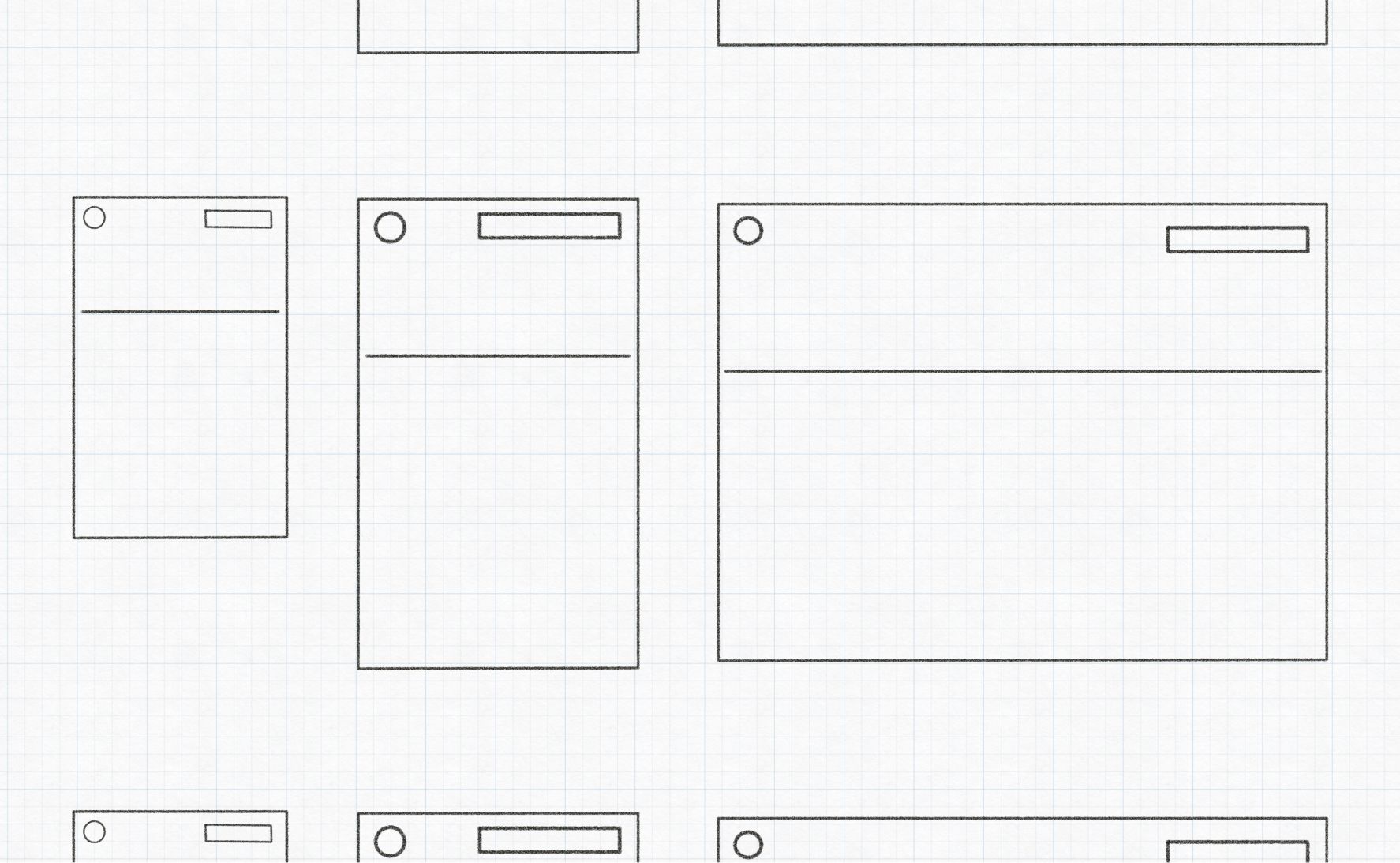
Navigation patterns explored 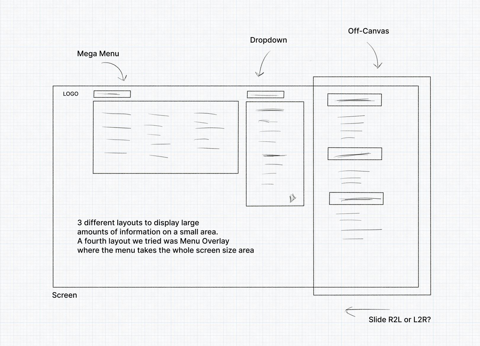
Main navigation alternatives
Why this information architecture matters
As we mapped the platform’s information architecture, our main goal was to reduce friction for users who work under pressure and with little screen time. That meant surfacing relevant actions quickly while minimising cognitive load.
We broke the app into five primary modules aligned to real kitchen operations:
- Menu planning
- Inventory
- Orders
- Compliance
- Reporting
Each module was structured around specific user roles — nutritionists, supply managers, chefs — so workflows matched their mental models. A head chef needed rapid access to recipe cards, ingredient availability and portion adjustments within one or two clicks. The inventory lead required structured dashboards to track low-stock alerts and approve vendor shipments.
These workflows were pressure-tested in early wireframe sessions and later refined through stakeholder feedback and usability heuristics. The result is a modular system designed to grow with operational needs while staying intuitive and role-specific.
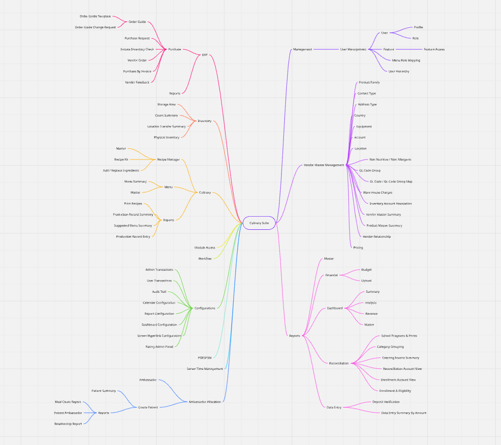
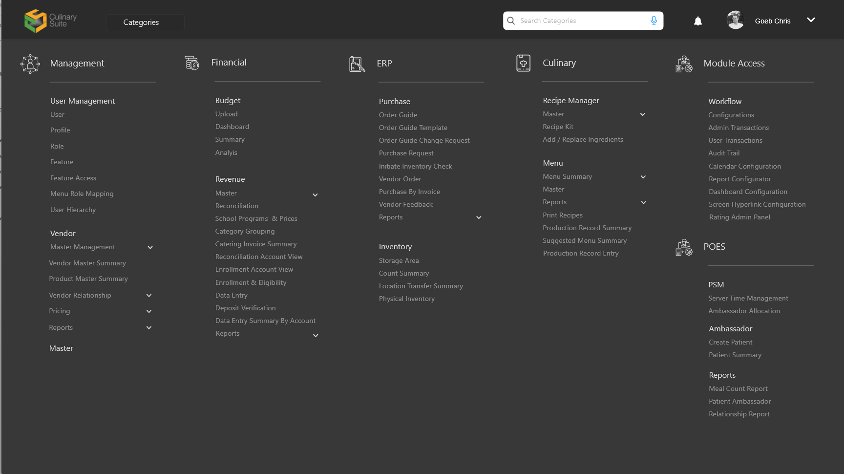
We validated this structure through stakeholder interviews and cross-role walkthroughs.
How we knew it held up
Component-driven UI testing
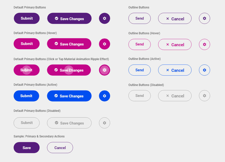
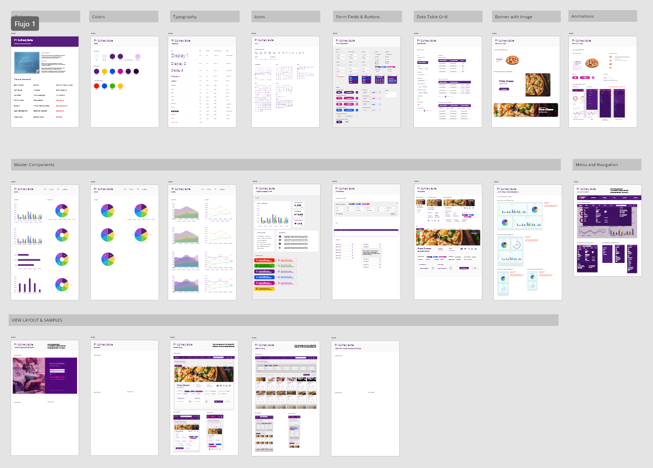
Design system foundations, built from the recipe screens outward rather than from an abstract kit inward.
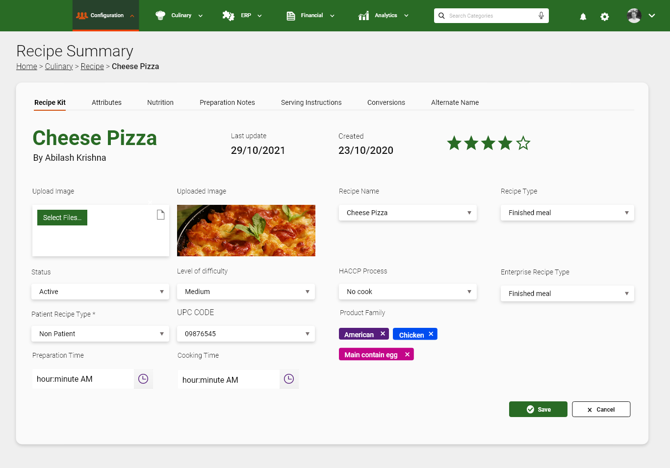
The recipe manager was the densest screen in the product, so it became the source of the component set rather than a consumer of it. Cards, filters and list rows were designed there first and then generalised.
Design system foundations: from recipes to components
12 weeks later
Twelve weeks from the first workshop to a design system in the engineering team’s hands, with the recipe flows rebuilt end to end.
Implementation
As we moved toward implementation, I worked closely with the engineering lead and front-end team to ensure a smooth handoff. All components were delivered through Figma, with documented specs, spacing guides and behaviour annotations tailored for responsive layouts.
We ran weekly design-dev check-ins to validate staging environments, clarify component behaviour and prioritise refinements based on real usage scenarios.
One key win was optimising touch targets and layout density after observing cafeteria staff use the system on mobile devices with gloves, or with very little time. By launch, all key user journeys — from recipe browsing to order summaries — were validated across breakpoints and roles.
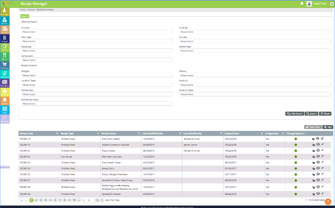
Recipe summary, before and after
Metrics & outcomes
What 12 weeks changed.
- Reduced task time
- 30%Reduced task time
- Onboarding cut from 1 hour to 15 minutes
- 15'Onboarding cut from 1 hour to 15 minutes
- Satisfaction in pilot testing
- 80%Satisfaction in pilot testing
Operators found the new layout easier to navigate.
Executive Chef at an industrial kitchen
Final thought
Our updated solution now includes a design system with rules made with and for the real users, and for our development team working in the Kendo React library alongside our first custom components.
With design instructions written in the developers’ language, the goal was to establish a bridge between design expectations and the realities of the tech stack, the resources and the time available.