Mobile-First Progressive Web App & Multistore Marketplace
ICBC · Main UX/UI Designer
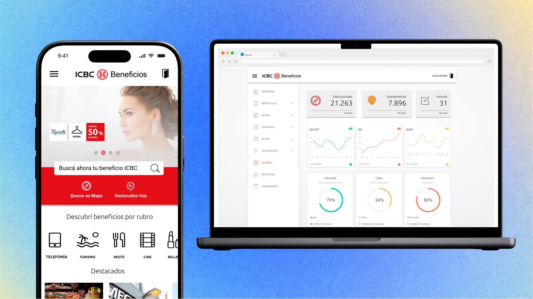
The primary goal was to rethink the marketplace, creating a tailored loyalty experience for ICBC clients. ICBC Mall Argentina is a custom marketplace focused on home, tech and travel, with loyalty rewards designed to improve ROI and credit-card usage.
- Research
- Interaction Design
- Enterprise UX Strategy
- Visual Design
- Design Systems
- Client
- ICBC
- Role
- Main UX/UI Designer
- Duration
- Figma prototype in 2 weeks
- Location
- Argentina
Metrics & outcomes
A marketplace with real scale behind it.
Launched in 2016, ICBC Mall is a pioneer in the digital marketplace industry, with over ARS 2 billion in annual sales and 150% year-over-year growth.
- Monthly users
- 200KMonthly users
- Target audience
- 2MTarget audience
- Growth year over year
- 150%Growth year over year
Research and discovery
The primary goal was to rethink the marketplace, creating a tailored loyalty experience for ICBC clients on top of an existing platform and an existing brand.
My job always starts with questions. That way I can understand both the big picture of a company and the user personas.
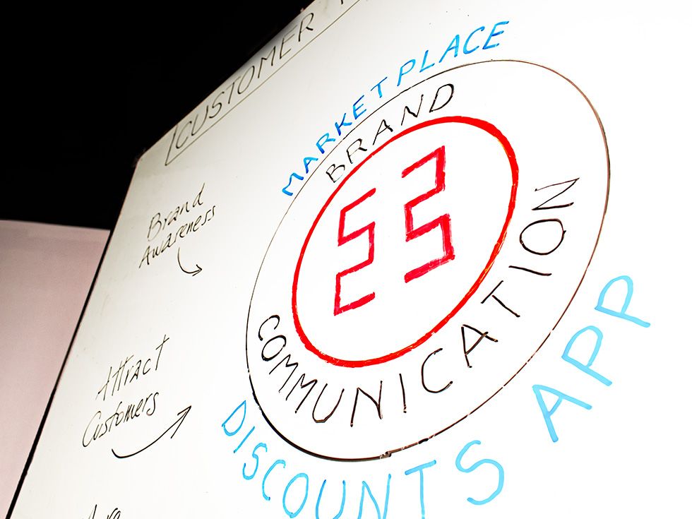
Customer rewards digital strategy
When it comes to offering tailored solutions, it is important to understand the root of the challenge, avoid the noise, and focus on what matters most. I often start from a previous solution, so the aim is not to reinvent the wheel but to elevate what is there and uncover the experiences it is missing.
Initial questions
Every engagement starts here. These six framed the whole project.
- Who are they?
- What do they see?
- What is their first impression?
- How is their overall UX?
- Who uses the website more often?
- What is in it for me?
User personas
ICBC clients across a 2M-person target audience, segmented by how and why they redeem: the everyday spender chasing discounts, the points accumulator saving for travel, and the credit-card holder who has never opened the loyalty programme at all.

Benchmarking
We analysed competitors and carried out benchmarking to understand patterns. Banking and finance includes big players; the key was how to differentiate and offer something distinct.
Research
Card sorting and rapid testing against the existing marketplace, mapped onto the categories that actually drive redemption: home, tech and travel.
Wireframing, design and Figma prototype
Initial sketches and wireframes based on eCommerce and customer-rewards best practices, and on the existing branding.
We envisioned several ways to navigate the discounts and offers: a map, an advanced search with filters, and a profile page holding all the user details including total points.
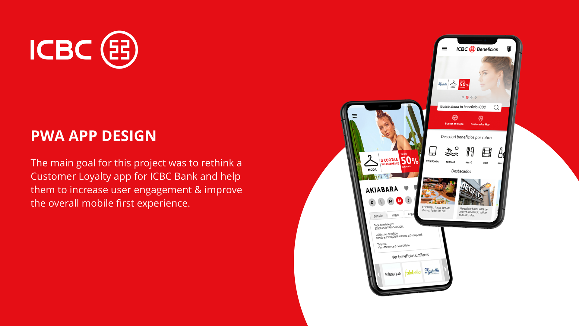
ICBC Loyalty PWA
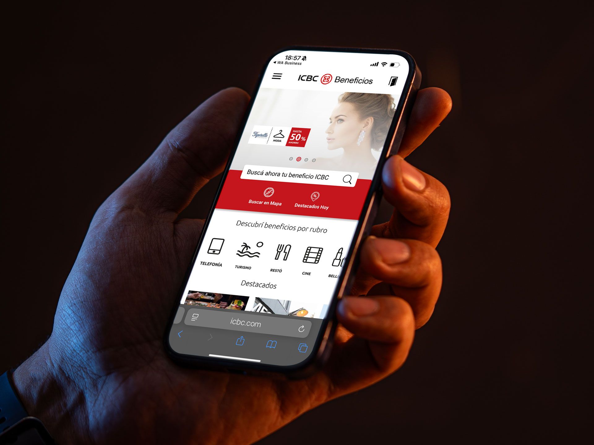
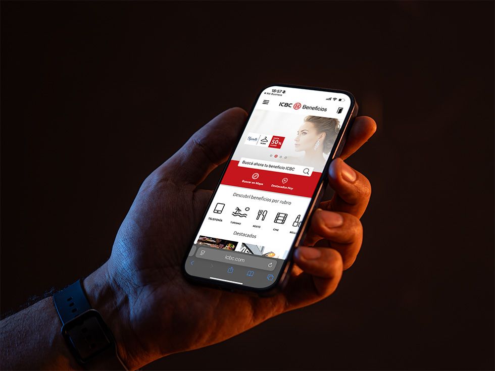
The focus of the Figma interactive prototype was to showcase the main features of the mobile app. The PWA approach let us bring new users in without requiring an install.
ICBC clients can browse the available discounts and benefits near them from their mobile device. Below is that interface rebuilt as working HTML rather than shown as a screenshot — switch the viewport to see the mobile-first layout adapt at the real breakpoints.
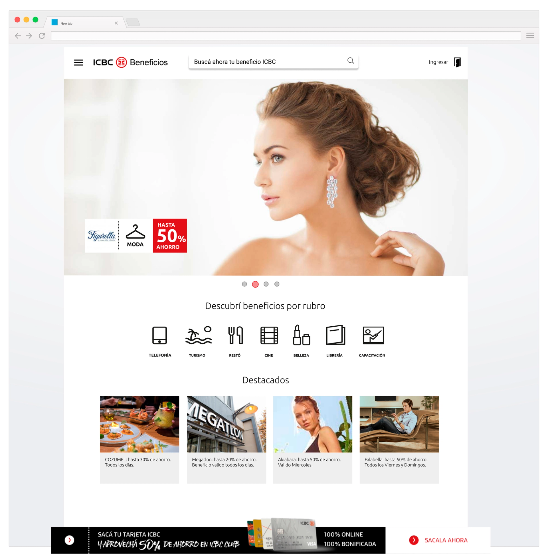
The marketplace, running
Category chips scroll, product cards respond to hover and focus, and the tab bar retires on desktop where the top bar takes over navigation.
Product display page
A product page in a loyalty marketplace has to answer two questions at once: what does this cost in pesos, and what does it cost in points. Both have to sit next to the instalment options without burying either.
This is the part that a screenshot loses most. The gallery, the colour and instalment selectors, the quantity stepper and the purchase bar that appears only once the primary buttons scroll away are all decisions about behaviour, not appearance.
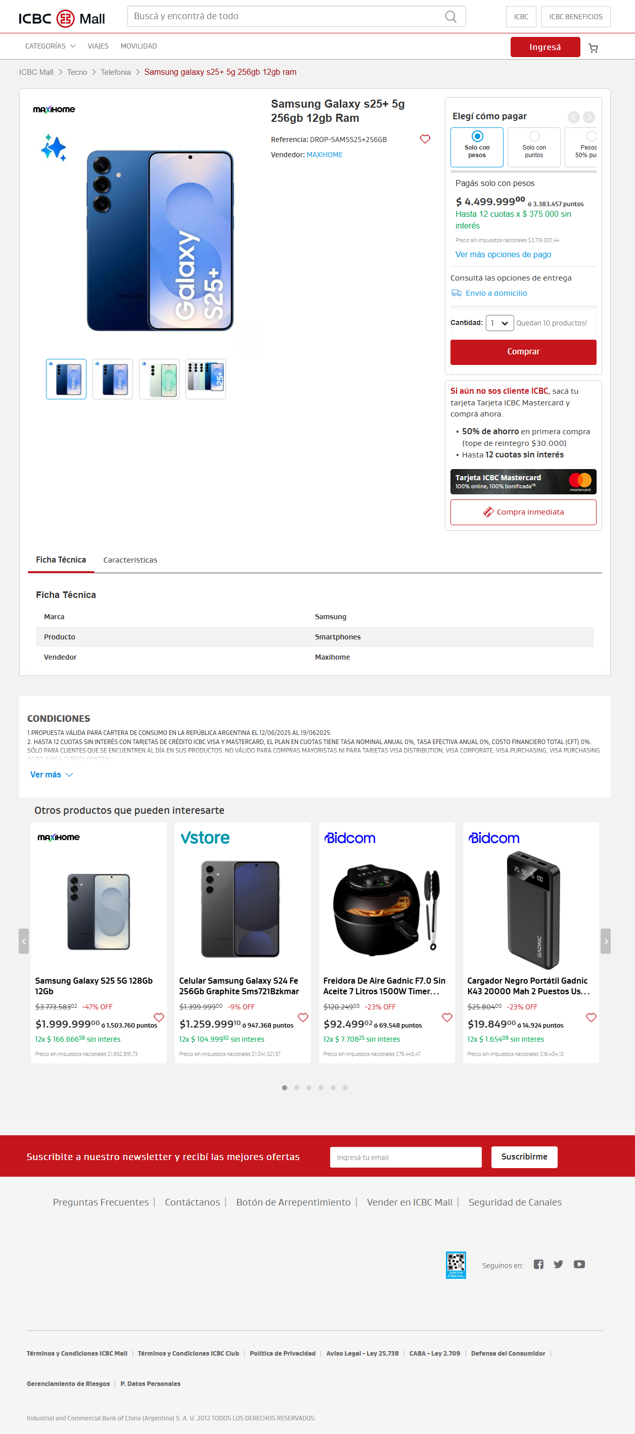
The product page, running
Pick a colour, change the instalment plan, step the quantity, open the accordions. On mobile, scroll past the buttons and the sticky purchase bar appears; on desktop it never does, because the buy box stays in view.
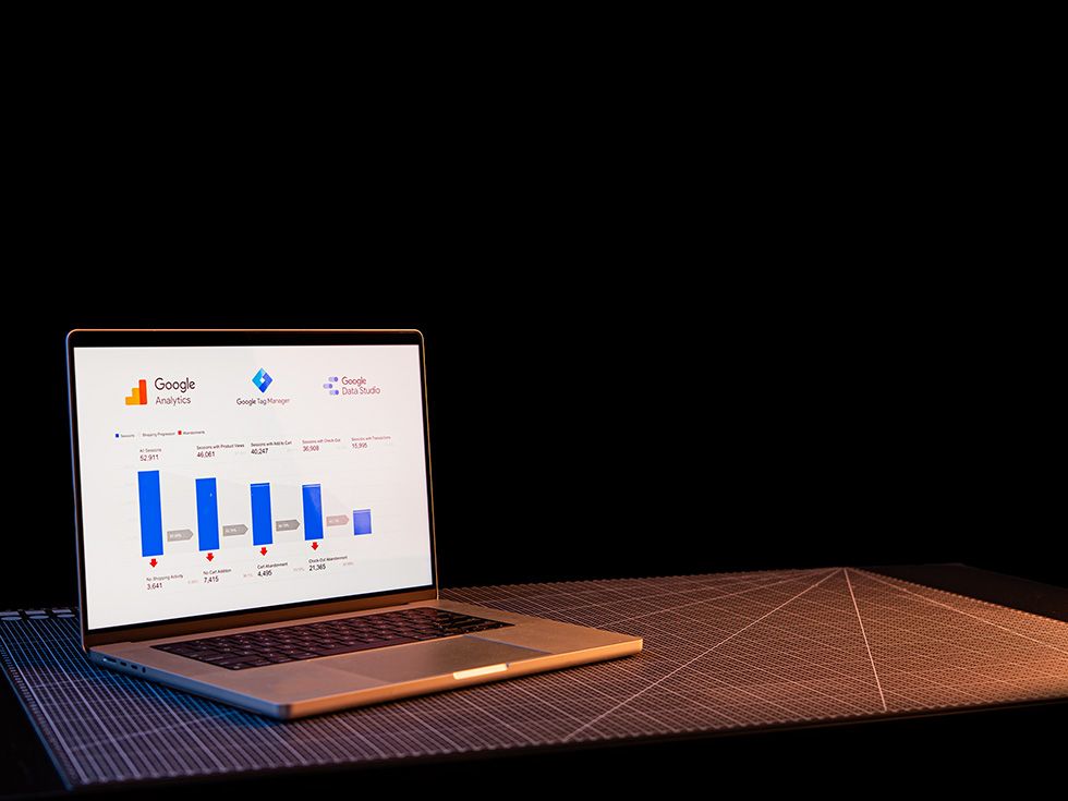
Looker reports, formerly Google Data Studio
Based on previous experience with Google Analytics, I proposed and led the implementation of advanced analytics tooling. We used enhanced ecommerce reports, Data Studio and GTM to improve the accuracy and consistency of the data, and to build better reporting for stakeholders.
Working alongside the COO, data scientists and front-end developers helped launch this faster across their marketplace projects. It added a new layer of data and consolidated complex reports into one set of tools.
Final thought
A Figma prototype ready in two weeks was enough to pitch the idea and get alignment. The loyalty layer went on top of a marketplace that was already working, which is the harder constraint: everything new had to earn its place against something people already used.