Design system
The system this site is built from
Every swatch, specimen and component below is rendered by the same code that renders the rest of the site — reading the same tokens, importing the same components. Nothing here is a mockup, so nothing here can drift out of date.
Principles
01
The interface is not the work
Every colour on a portfolio page should come from the work being shown. A neutral system means a client logo or a product screenshot never competes with the chrome around it.
02
Weight over ornament
Hierarchy is built from type size, weight and whitespace rather than boxes, shadows and rules. One hairline border and one radius carry the whole system.
03
Both themes are first-class
Light and dark are not a toggle bolted on at the end. Logos ship in two variants and swap with CSS, so they are correct on first paint rather than after a script runs.
04
Fast is a design decision
Pages ship no framework JavaScript. Disclosure, comparison sliders and navigation use native HTML elements, which are lighter and more accessible than the component-library equivalents.
Colour
Surfaces
src/styles/global.cssThe palette is intentionally achromatic. Client logos, project imagery and photography carry every bit of colour on the page — the interface stays out of their way.
light
- Background
--color-background - Foreground
--color-foreground - Card
--color-card - Muted
--color-muted - Muted foreground
--color-muted-foreground
dark
- Background
--color-background - Foreground
--color-foreground - Card
--color-card - Muted
--color-muted - Muted foreground
--color-muted-foreground
- --color-background
- Page canvas
- --color-foreground
- Body and heading text
- --color-card
- Raised surfaces: project and testimonial cards
- --color-muted
- Quiet section backgrounds
- --color-muted-foreground
- Secondary text, captions, metadata
Interaction
src/styles/global.cssA single inverted pair does all the work. Primary is black on white in light mode and white on black in dark — the emphasis comes from inversion, not from a brand colour.
light
- Primary
--color-primary - Primary foreground
--color-primary-foreground - Accent
--color-accent - Border
--color-border - Ring
--color-ring
dark
- Primary
--color-primary - Primary foreground
--color-primary-foreground - Accent
--color-accent - Border
--color-border - Ring
--color-ring
- --color-primary
- Buttons and primary actions
- --color-primary-foreground
- Text on primary surfaces
- --color-accent
- Hover states on quiet controls
- --color-border
- Hairlines, dividers, card outlines
- --color-ring
- Focus indicator
Typography
Typefaces
src/styles/global.cssZalando Sans carries everything from the hero to body copy. Geist Mono is reserved for labels, dates, figures and code — anything that should read as data rather than prose. Both are self-hosted, so there is no third-party request on the critical path.
Sans
Zalando Sans
Aa Bb Cc — 0123456789
Mono
Geist Mono
Aa Bb Cc — 0123456789
Scale
Six steps, each with one job. Anything not on this list is a mistake.
Display
Trusted worldwide by 30+ companies
Homepage hero only. Tracking tightens to −0.035em; at this size default spacing reads loose and generic.
Page title
Digital Strategy That Connects
Case study and article titles.
Section
Research and discovery
Top-level sections within a page.
Subsection
Stakeholder map
Headings inside a case-study section.
Body
I work as a digital product designer, with a systemic mindset and a strong foundation in team collaboration.
Relaxed leading. Long-form copy sits in a 2xl column — roughly 70 characters.
Meta
Before 1.0v (2021)
Geist Mono for labels, captions, dates and figures. Signals data rather than prose.
Form
Radius
One radius, scaled. Cards and images sit at lg (16px), matching the current site; buttons and tags go fully round.
sm
Inputs, tags
md
Small controls
lg
Cards and images — the default, 16px
xl
Hero imagery
Buttons
Primary inverts against the page. Secondary is a hairline. There is no third.
Components
Rendered from live content in the CMS, so each one is shown with copy of the length it actually has to handle.
Client logo
src/components/LogoMarquee.astroEach logo ships light and dark variants, swapped with CSS rather than JavaScript so they are correct on first paint. Toggle the theme to see it.


Project card
src/components/ProjectCard.astroThe whole card is a click target via a stretched pseudo-element, but only the title enters the accessibility tree as a link — so screen-reader users get one link, not four.
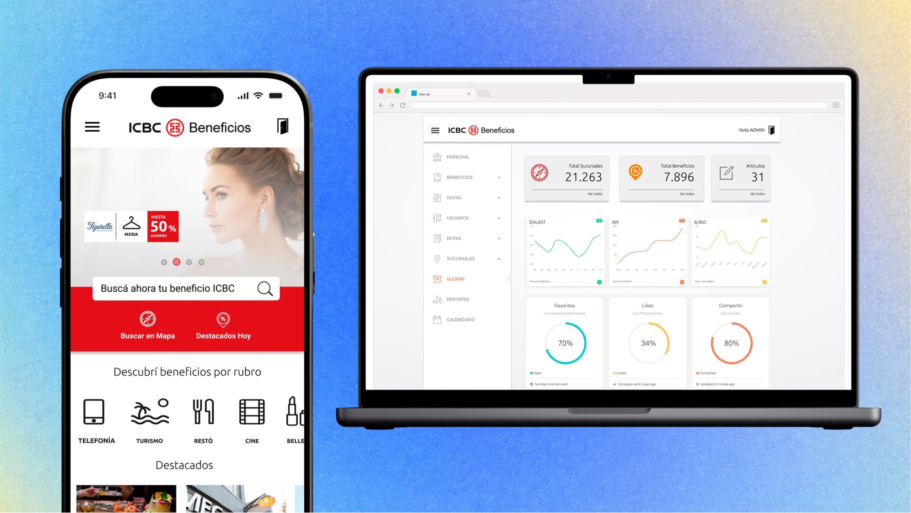


Bank Mobile-First PWA & Marketplace
ICBC Mall Argentina es un marketplace a medida, enfocado en categorías como hogar, tecnología y viajes, junto con una estrategia de recompensas y fidelización para mejorar el ROI y fomentar el uso de la tarjeta de crédito. Prototipo en Figma desarrollado en 2 semanas para presentar y validar la propuesta con el cliente.
- Growth Rate
- 150%Growth Rate
- Target Audience
- 2M+Target Audience
- Unique Visitors
- 200K+Unique Visitors
Testimonial card
src/components/TestimonialCard.astro“¡Me siento muy afortunado de haber tenido la oportunidad de trabajar con Andrés! Es colaborativo, proactivo y confiable. Siempre valoré su capacidad de pensar varios pasos adelante y de formarse de manera autónoma para resolver problemas de UX. También es flexible y abierto a las ideas de los demás, al mismo tiempo que aporta un punto de vista sólido propio, todo de una manera que hace que trabajar juntos sea fácil, dinámico y natural. Realmente me encantaría tener la oportunidad de volver a trabajar con Andrés.”

Chris Urbina Meierling
Product leader building teams in complex spaces like healthcare, government, and education.
Pull quote
src/components/blocks/PullQuote.astroUsed inside case studies. Can reference a testimonial record or carry its own copy.
“¡Me siento muy afortunado de haber tenido la oportunidad de trabajar con Andrés! Es colaborativo, proactivo y confiable. Siempre valoré su capacidad de pensar varios pasos adelante y de formarse de manera autónoma para resolver problemas de UX. También es flexible y abierto a las ideas de los demás, al mismo tiempo que aporta un punto de vista sólido propio, todo de una manera que hace que trabajar juntos sea fácil, dinámico y natural. Realmente me encantaría tener la oportunidad de volver a trabajar con Andrés.”
Chris Urbina Meierling
Product leader building teams in complex spaces like healthcare, government, and education.
Metrics
src/components/blocks/StatGroup.astroFigures are tabular-lined so columns align. Labels stay full sentences rather than being truncated.
- Of support tickets resolved within 1 interaction
- 89%Of support tickets resolved within 1 interaction
- Websites spanning one unified design system
- 8Websites spanning one unified design system
- Increase in customer engagement
- 20%Increase in customer engagement
Disclosure
src/components/blocks/Accordion.astroNative <details> with an exclusive group. Zero JavaScript, full keyboard support.
Disclosure uses the native element
Keyboard handling, focus order and ARIA semantics come from the browser. The name attribute makes the group exclusive, which is the only behaviour a component library would have added.
Only one section stays open
Opening this one closed the other. No JavaScript is involved.
Motion & interaction
Every one of these is plain HTML, CSS and a few lines of vanilla JavaScript. No animation library, no framework. Three rules apply to all of them: content is visible before the script runs, prefers-reduced-motiondisables the motion entirely, and nothing is gated behind an interaction.
Count up
src/components/interactions/CountUp.astroTakes the display string, not a number — real metrics carry prefixes and suffixes like 34.9%, $150 or 10/10. The final value is in the HTML from the start, so it is correct for screen readers and search engines even if the script never runs. Scroll it into view to fire it.
Scroll reveal
src/components/interactions/ScrollReveal.astroVisible by default and only hidden once JavaScript confirms it can animate it — a failed script can never leave content invisible, which is the usual failure mode of scroll animations. Supports a stagger between children.
01
Revealed with a 0ms delay
02
Revealed with a 120ms delay
03
Revealed with a 240ms delay
Step sequence
src/components/blocks/StepSequence.astroA short numbered flow. An ordered list, because the order is the content.
Tap to open
A single bubble, always in reach.
Ask anything
Plain language, no menu to learn.
Instant answer
Reads the same data as the dashboard.
Activity chart
src/components/blocks/CadenceChart.astroCSS grid bars rather than a charting library: a few dozen bars do not justify a charting runtime, and plain elements are easier to make accessible than generated SVG. Every value is in the markup, and there is a table view for anyone the chart does not serve.
View as table
| Date | Commits per day |
|---|---|
| Apr 6 | 12 |
| Apr 7 | 34 |
| Apr 8 | 58 |
| Apr 9 | 72 |
| Apr 10 | 44 |
| Apr 11 | 19 |
| Apr 12 | 47 |
| Apr 13 | 55 |
| Apr 14 | 38 |
| Apr 15 | 26 |
| Apr 16 | 11 |
| Apr 17 | 40 |
| Apr 18 | 33 |
| Apr 19 | 18 |
| Apr 20 | 9 |
| Apr 21 | 31 |
| Apr 22 | 28 |
| Apr 23 | 16 |
| Apr 24 | 5 |
| Apr 25 | 3 |
| Apr 26 | 27 |
| Apr 27 | 22 |
| Apr 28 | 14 |
| Apr 29 | 8 |
| Apr 30 | 4 |
Contrast checker
src/components/blocks/ContrastChecker.astroRatios are computed at build time from the hex values, never transcribed. A hand-written ratio stops being true the moment either colour changes, and an accessibility table that silently goes stale is worse than none. Change a hex and the verdict follows.
- AaThe quick brown fox
Foreground on background
#08090a / #ffffff
19.93:1AAA - AaThe quick brown fox
Inverted
#ffffff / #08090a
19.93:1AAA
Computed with the WCAG 2.1 relative-luminance formula at build time. Target is AA — 4.5:1 for body text, 3:1 for large.
Lightbox
src/components/interactions/Lightbox.astroProgressive enhancement: it wraps existing figure markup at runtime rather than requiring every image component to know about it. Uses a native <dialog>, so focus trapping and Escape come from the browser. Click any case-study image to see it.
Applied globally to images inside main figure. Decorative and small images are skipped.
Metrics over media
Full-bleed figures, over video or image.
Shown here without a background so the composition is legible on its own.
Breaks out of the page container without leaving the document flow, so it can sit anywhere in a case study. The video is decorative — muted, inert, aria-hidden — and only starts once the section is on screen. The figures are real text on top, never baked into the video.
- Commits
- 1,150Commits
- Days
- 46Days
- Leads captured
- 421Leads captured
Why this page exists
A portfolio can describe a way of working, or it can be one. This page is the second: the same tokens, the same components, the same constraints, shown in the open. If something here looks wrong, it is wrong on the site too — which is the point.